April 28, 2010

Yosemite ROCKS!

Wow! What a great trip. The western side of the country definitely has a lot to offer. After a few unfortunate mix-ups with the rental car company, we finally got to our destination. Yes, dedicated photographers are crazy enough to take a two-hour taxi ride. But it was definitely good we got there, because two days later we got a foot of snow! In April! Phew. Glad we were there. And definitely glad the park had a free shuttle service.


My take on Ansel's favorite spot.


Frozen Mirror Lake


El Capitan in the fog…


Trekking through the snow!

Reminds me of Narnia!

We got to shoot in two different seasons in one week!


And even tried a couple night shots!

All in all, a fantastic trip. More shots to come…hopefully. If I'm not too busy.

--Andy


March 5, 2010

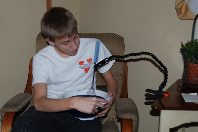
7 Non-Photographic Uses of Wimberley's Plamp

Thanks to Wimberley for lending us great gear and giving us the Plamp!  It is such a well-reviewed product and everyone should go buy one! Thanks Wimberley!

Here are my 7 non-photographic uses for the Plamp. Enjoy ;)

1. Portable Hat Holder


2. Tray Table


3. Nurse/Personal Care Taker


4. Tissue Dispenser


5. Automatic Tooth Brush


6. Note Taker


7. Baking Tutor


October 25, 2009


Jackson Hole, Wyoming

      This shot was taken when we were just arriving in Jackson Hole. We were stocking up on our food supply for the place we rented. Sunsets over buildings are sometimes just too good to resist. In order to get the light in the parking lot and the beautiful sky, I used Photomatix Pro to merge two photos to create an HDR image (HDR stands for High Dynamic Range, which lets you capture a much farther range of light than what your camera can normally see). This particular HDR, due to it's low light, had a lot of noise. I used Nik's Dfine 2.0 (thanks to Alex Walker) to get rid of much of that noise.

October 10, 2009

Across the Lake


Washington, D.C.

      As I was thinking back to where I took this shot, I decided that I really don't remember taking it. (I know I took it though :P) So I don't really have much of an explanation for this shot, so you'll just have to make one up for yourself. I do know that it was a series of 5 images stitched together with Photoshop's Photomerge.
      So, as I am redesigning our website (www.lojophotography.com) I decided that we needed a new logo. Our current one was getting a little big for somethings, so I went with a square text-based logo. I'm pretty happy with it. I will put the new logo in all of the images I post here, just incase some sly dog tries to steal my images.

October 6, 2009

Sailing at Sunset


Lake Cayuga, Ithaca, New York

     I think what makes this shot really pop is the clarity of the water in the foreground. At least, that's what makes it for me. I was also pretty pleased with the placement of the sailboats. I think it keeps the eye entertained more than just a normal sunset would. This was just a handheld exposure and is basically right out of the camera. I did lighten up the sailboats a little bit and gave a little more contrast to the waves and the clouds. I also cloned out a couple distracting (i.e. not sailboats ;) elements from the right side of the photo. This one of the last shots I took that night, and there was just enough light to make a decent exposure. I think this is my only lake shot from that trip that I'm satisfied with. It still amazes me that when you press the shutter, and you think you have a dynamic photo, then you look at it on the computer and it's either dull or not the composition you thought it was. On the other hand though, there are some that you think don't have a chance, yet they become some of your favorite shots from that location. Ah, the wonder of photography.    

October 5, 2009

Fairy Tale Waterfall


Buttermilk Falls, Ithaca, New York


     This shot was taken on a family hike down the Buttermilk Falls near Cayuga Lake. In order to get that silky smooth water fall, I used a 0.6 Neutral Density filter (the neutral density filter is basically a dark piece of glass that sits in front of the camera in order to slow the shutter speed enough to get the silky waterfall). One of the challenges of this shot was the dappled light that was erratically falling throughout the frame. This created a high difference in the light I was exposing for. Luckily (thanks to the awesome meter in my camera...) it exposed just in between and I was able to dodge and burn to enhance the fairy tale-like look the camera gave me. One thing I find great about dodging and burning is that it gives you an opportunity to lead the audience's eye where you want it to go. For example, the eye starts in the small waterfall in the bottom-most left hand corner and gradually follows the line of falls until it settles in the middle. Keeping the viewers focus inside the frame is what makes people think it is a good photograph. I also added a blur to the edges of rocks that don't have falls going over them, just to further make sure the eye is where it needs to be.

Under the Bridge--The Grunge Look


Downtown Lynchburg, Virginia

    So on Saturday, we went downtown to scout out a couple "iconic" Lynchburg shots, you know, the ones looking across the river with the sun and clouds just right. Well, we didn't get any of those. But I did get this interesting shot of the underside of the bridge coming into town over the James. Due to all the dirt and graffiti, I felt inclined to make this shot a "grunge" style shot. This was my result. I have mixed feelings about it. Didn't really get exactly the look I was going for, though I do like the high contrast and desaturated tone. I think if, when I had shot it, I had gotten a little more detail in the right side where the sun is coming in, I would have been more pleased. They can't all be good right? Below is the final result from Photoshop compared to the original RAW file. I also explain how the effect was reached in Photoshop.


After                             Before

    As you can see, I applied a pretty healthy serving of contrast to bring out some of the dirt in the walls (this was done with a curves adjustment layer). Then I did a little dodging and burning to bring out more contrast than what the Curves layer was giving me (to all you non-Photoshop people, the "Curve" refers to the lights and darks of the image and when you make the lights lighter and the darks darker it makes an S-shaped curve. The bigger the 'S' the more contrast there is.) The next step was to apply selective desaturation throughout the image (except for the greens, I felt they framed the image well and added some taste). This was done through a gradient map with a mask on it to keep some of the color of the leaves. I decided against a regular desaturation layer because the gradient map gets you just a little bit more contrast (by the way- at first when you apply a gradient map layer it will look odd. Make sure you invert the values). As you can see in the second image, it gives you a little more 'pop' and makes a pretty boring picture more interesting.